Potentially the most important page in a site redesign project. Comparing flight itineraries beyond price considerations was proving challenging. This project's purpose what to lessen customer confusion and abandonment. These changes would need to remain faithful to existing Department of Transportation rules regarding flight sales.
↓ Current version.
↓ Version 1.
Business considerations:
1. Previous versions of flights search suffered from low conversion rates. This needs to improve.
2. Lessen the number of searches a user performs.
3. Tie this new UX with the rest of the brand's redesign.
2. Lessen the number of searches a user performs.
3. Tie this new UX with the rest of the brand's redesign.
User testing findings:
1. Users had limited experience comparing flights, and their main reason for search abandonment was a lack of confidence in finding the best fare at the right price.
2. When users explored prices of fares on other sites, or applied filters to our results, conversion rates increased.
3. Users did not know how to easy perform a new search or modify their existing one.
4. Users noted certain amenities were very important in their purchasing decision-making.
2. When users explored prices of fares on other sites, or applied filters to our results, conversion rates increased.
3. Users did not know how to easy perform a new search or modify their existing one.
4. Users noted certain amenities were very important in their purchasing decision-making.
Design considerations:
1. Design patterns on color, forms, UI, and other constants were taken from the evolving style guide.
2. A prominent-placed summary area was added to call out the overall best, shortest, and recommended flights for users who did not want to deeply search. These would be calculated on a scale relying on flight times, price, number of stops, and other factors.
3. Amenities that were frequently identified by users as important—power plugs, food, and entertainment—were noted on each itinerary.
4. When several similar flights were noted, these were rolled up to allow for easier comparison of itineraries (these could be unrolled, however).
↓ Version 2.
Business considerations:
1. Three columns were considered too tight, and didn't allow for planned ad placements.
2.
3.
2.
3.
User testing findings:
1. Users noted that the number of stops was an important consideration in choosing a flight, rating it higher in importance vs. any amenity.
2. The filters received too much mousehover and eyeball-tracking attention.
3. Users preferred to scan the prices on the left, rather than on the right, as they frequently got this information confused with the content in the right-hand column.
2. The filters received too much mousehover and eyeball-tracking attention.
3. Users preferred to scan the prices on the left, rather than on the right, as they frequently got this information confused with the content in the right-hand column.
Design considerations:
1. By this time, the importance of vivid imagery had been identified as a key UX brand feature. Adding a wide image to the top of the page (similar to the homepage's layout from which the user would have just visited), would emphasize recall & consistency and allow for easier framing of the Cheapest/Fastest/Best callouts.
2. The filters column was rolled up into a small link above the search results to remove potentially-distracting elements vs. browsing itineraries.
3. Itinerary prices were moved to the lefthand side for easier scanning.
2. The filters column was rolled up into a small link above the search results to remove potentially-distracting elements vs. browsing itineraries.
3. Itinerary prices were moved to the lefthand side for easier scanning.
Note: The "Cheapest Flight" itinerary information has been clicked and expanded above.
↓ Version 3.
Business considerations: none.
User testing findings:
1. Certain user groups converted at a much higher level when an airline matrix summary of cheapest/non-stop/1+ stops was visible and could be explored.
2. Users didn't interact with the filters link at the anticipated rate.
3. Users were surprised to find they'd chosen flights which arrived the next day.
2. Users didn't interact with the filters link at the anticipated rate.
3. Users were surprised to find they'd chosen flights which arrived the next day.
Design considerations:
1. Airline matrix was prominently positioned for easy interaction.
2. Results summary information (number of results, filters link, and sorting option) were framed to give more prominence.
3. Placement of "this flight arrives the next day" was added in a prominent location.
2. Results summary information (number of results, filters link, and sorting option) were framed to give more prominence.
3. Placement of "this flight arrives the next day" was added in a prominent location.
↓ Version 4.
Business considerations:
1. A featured itinerary should be tested to see if it had any traction.
2. Itinerary amenities were found to not be accurate: not every segment could reliably assumed to have the same amenities.
2. Itinerary amenities were found to not be accurate: not every segment could reliably assumed to have the same amenities.
User testing findings:
1. Airline matrix interaction was low.
2. Filters remained underused in comparison to when they were prominently displayed.
3. Users were surprised at the fees applied to the ticket when reviewing their purchase on the checkout page and abandoning the site. These fees needed to be made apparent earlier so users could easily find a suitable alternative.
Design considerations:
1. The flights matrix was moved into the framed image area at the top for prominence reasons.
2. This allowed for room to greatly expand the filters: though they were individually rolled up, their presence was increased.
3. Several areas were added to push purchase urgency, such as fares were on sale for a limited time, or itineraries had only a handful of seats remaining.
4. Amenities were moved to the flight details level so they would accurately pertain to their respective flight segments.
5. Featured itinerary was added in a highlighted style to see if another option to assist in decision-making would be helpful.
Note: The itinerary details are exposed for demonstration purposes.
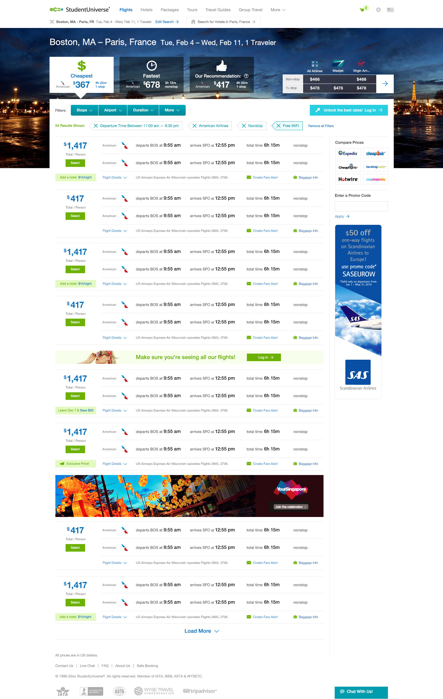
↓ Version 5.
Business considerations:
1. The Marketing department (who would maintain the top images) deemed the narrow & wide top image too difficult to reliably maintain/art-direct, due to the dwindling amount of negative space.
User testing findings:
1. Filter engagement increased, but remained lower than when it was prominently displayed in the lefthand column.
Design considerations:
1. A design pattern for tabs had been introduced at this point on the website's homepage, and applying this pattern to the Cheapest/Fastest/Recommended callouts matched this functionality.
2. The reliance of sometimes-confusing icons on the rolled-up filters was replaced with text. When each was clicked, it would open a filter pane.
3. Header image area was modified to allow easier creation of art-directed images. This acted as a "frame" around the top search result, drawing to it greater attention.
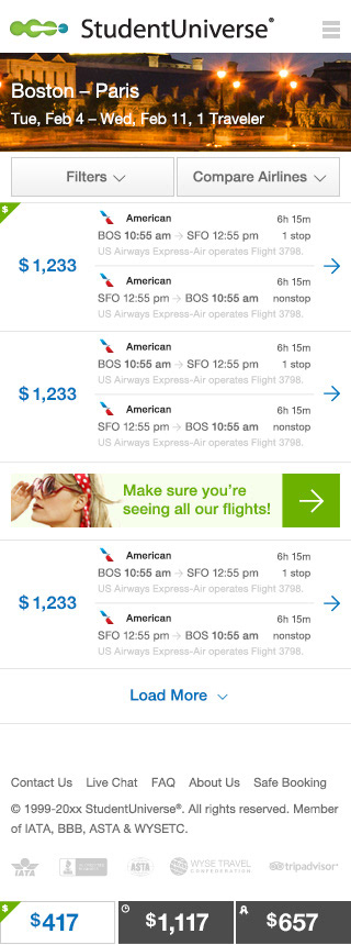
4. With this round, a robust mobile version was designed, with itineraries presented in more of a summary design for easier scanning and only succinct details exposed.
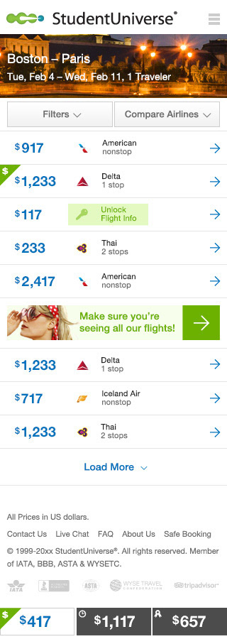
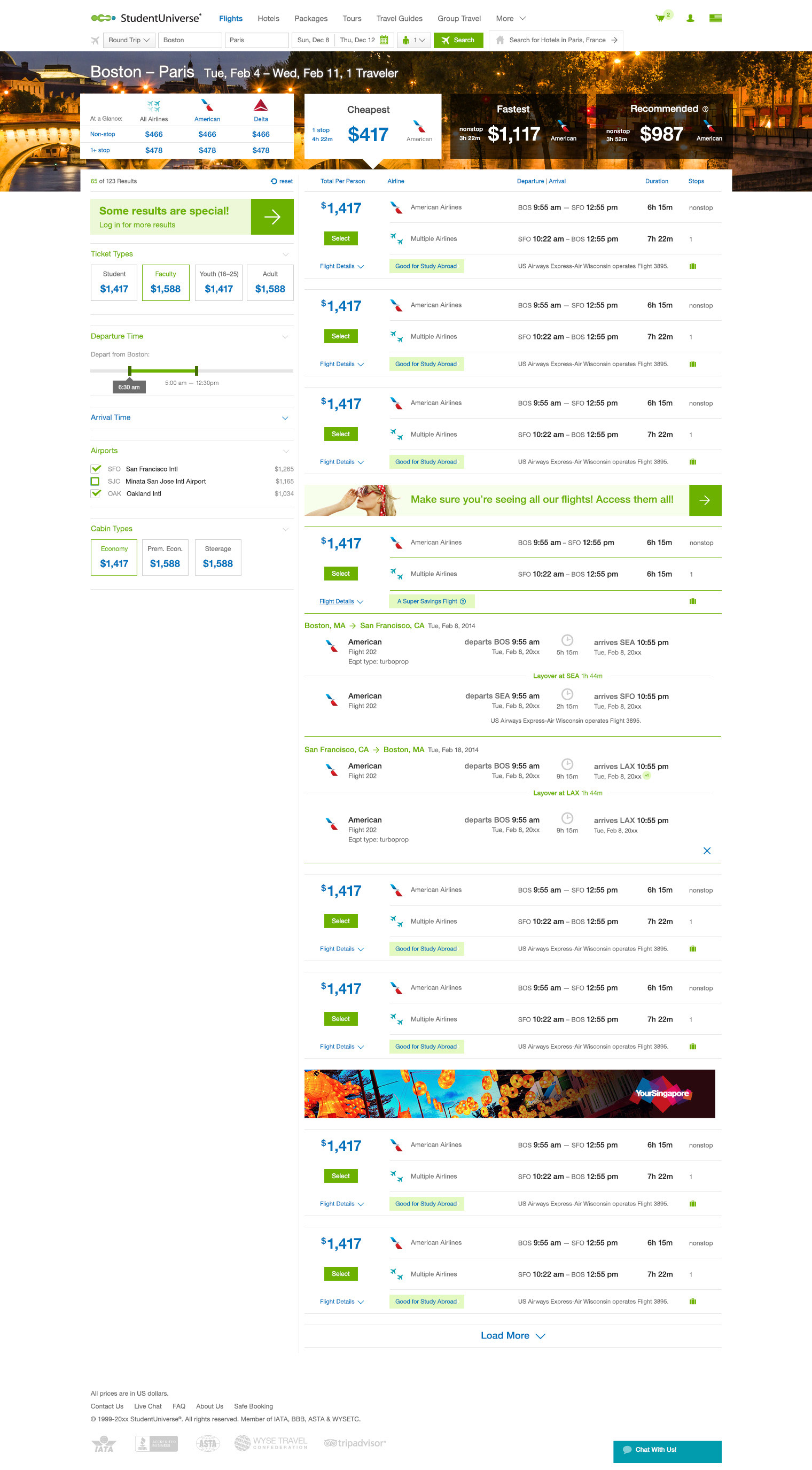
↓ Version 6.
Business considerations:
1. Mobile view needed to have more details exposed on this page, so the rate of changes to cart and abandonment rates would decrease.
User testing findings:
1. Interaction with filters was still lower than when they were exposed in the left-hand column.
2. Users seemed to have more click hesitancy. It was determined this was due to too many elements seeming clickable by being called out in button-like, colored elements, taking them away from easily adding a flight to their carts.
2. Users seemed to have more click hesitancy. It was determined this was due to too many elements seeming clickable by being called out in button-like, colored elements, taking them away from easily adding a flight to their carts.
Design considerations:
1. Filters were returned to the left-hand column, and these types of filter UIs were overhauled to work for both flights and hotels results, and added to the design system.
2. The usage of the brand's secondary color on filters didn't match the evolving design system.
3. Additional flight details were exposed on mobile view, matching that of the desktop display.
2. The usage of the brand's secondary color on filters didn't match the evolving design system.
3. Additional flight details were exposed on mobile view, matching that of the desktop display.
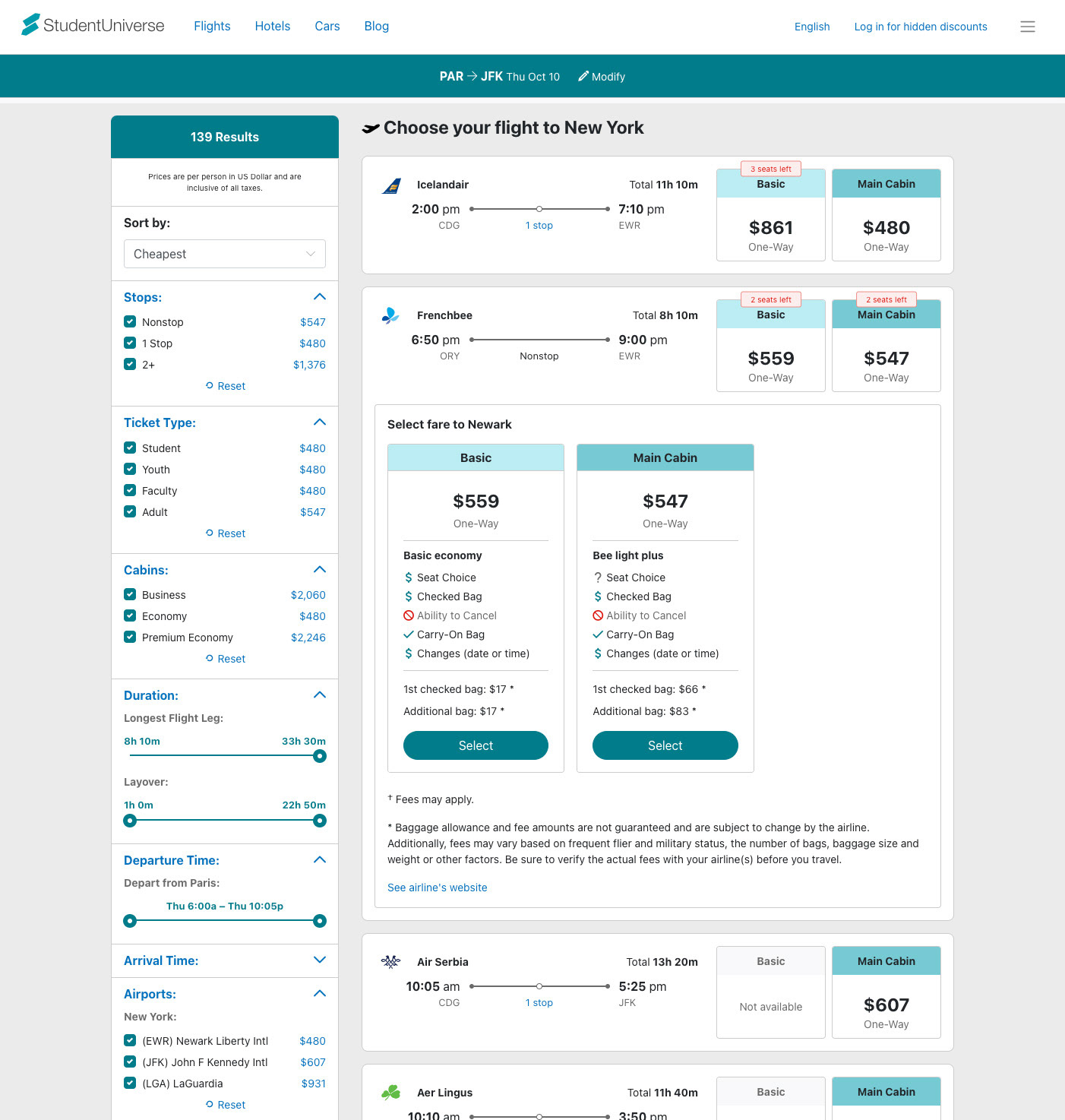
↓ Current version. Subsequent changes to the design:
Business considerations:
1. A requirement to display multiple cabin options on a given flight (explained in more detail on the Case Study: Cabin Comparison Redesign page).
User testing findings:
1. Users had gradually become accustomed to seeing more amenities on itineraries. Over time, airlines were more reliably suppling this information (prior, it had been on a per-airline basis, making those airlines who lacked that information look incomplete or problematic).
2. Engagement with Cheapest/Fastest/Best rates was low, so this feature was diminished.
3. Testing the initial method of displaying to users a combined outbound/return package converted at a lower rate vs. allowing them to choose each leg separately. Users noted that they felt more confident that they chose the right flight when presented with this option.
Design considerations:
1. Color and UI changes were applied from the evolving company design system.
2. Cabin alternatives were added.
3. important amenities per cabin were added.
4. The outbound and return leg choices were split up into two screens. It was important to prominently display their outbound choice at the top of the return trip page.
2. Cabin alternatives were added.
3. important amenities per cabin were added.
4. The outbound and return leg choices were split up into two screens. It was important to prominently display their outbound choice at the top of the return trip page.
