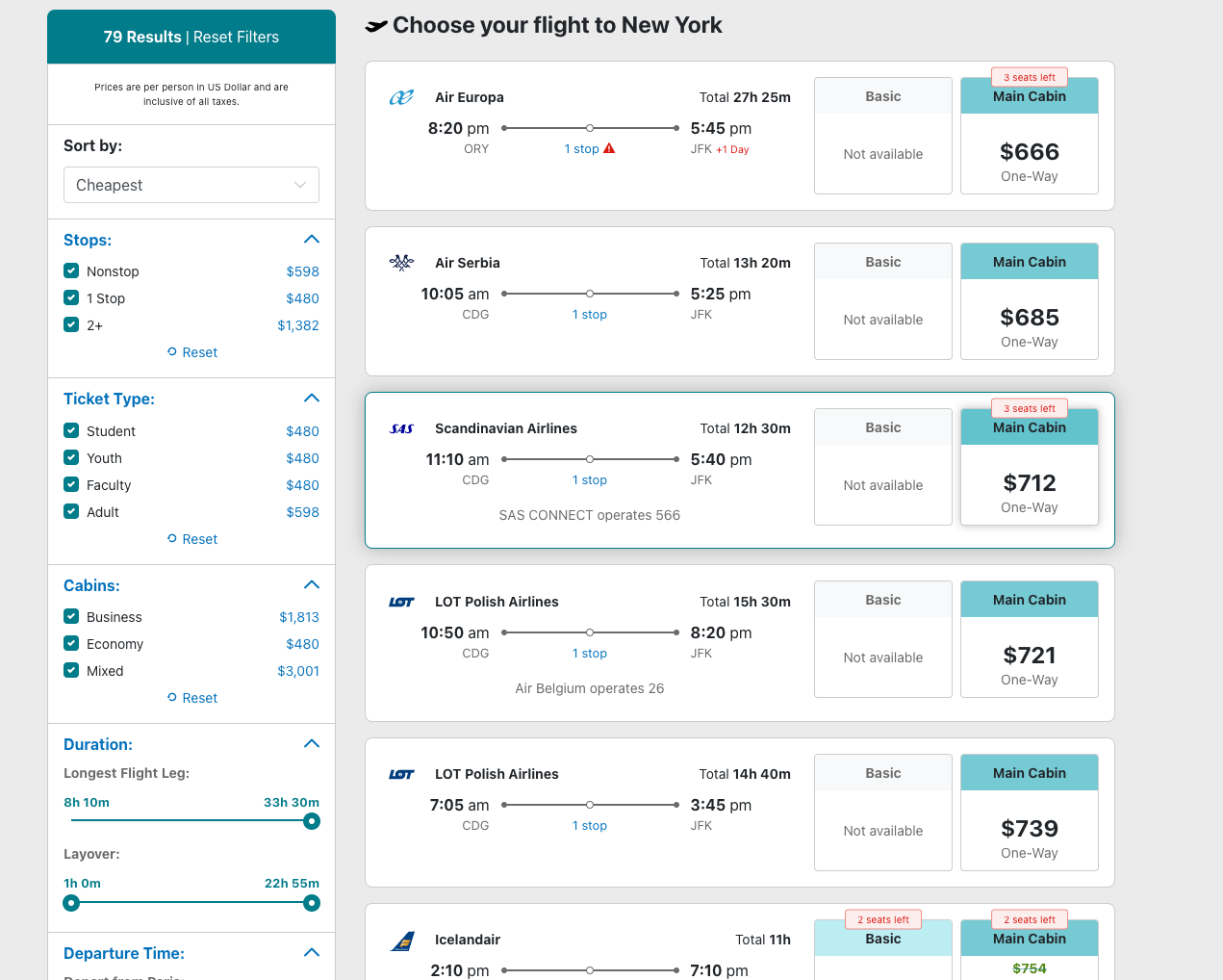
A recent project was the challenge of modifying an existing airfare site's search results page to accommodate and clarify the differences between cabins (those being Economy, Main, and Premium seats) on an existing flight, and their perceived values to the customer. In an era where low-cost carriers can undercut traditional airlines in price (at least at first glance), it was imperative to these latter carriers that a different way to display their unique value was needed.
While the price of a low-cost carrier's ticket often can be much cheaper than a traditional airline's Economy ticket, once you factor in the additional costs of carry-on bags, seat changes and cancellations, suddenly that low-cost carrier's ticket is much more restrictive and now similarly-priced as that of the traditional carrier's offerings.
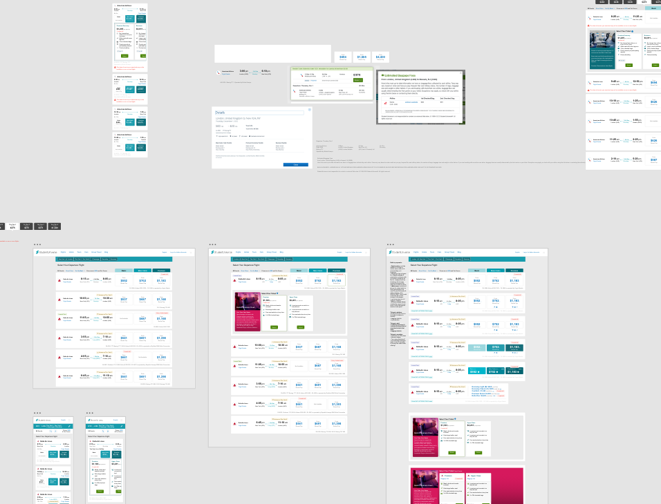
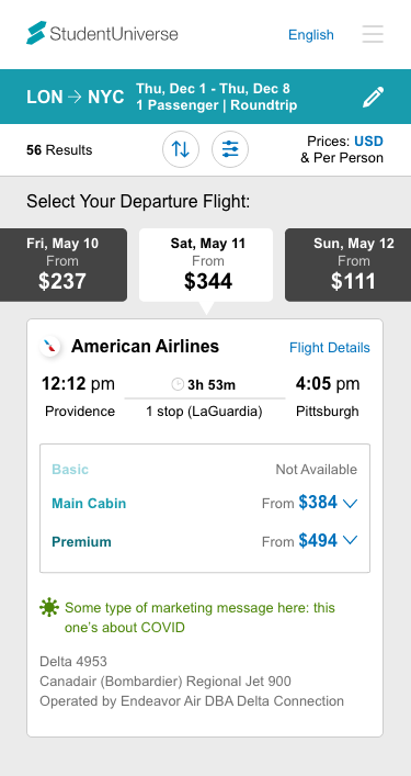
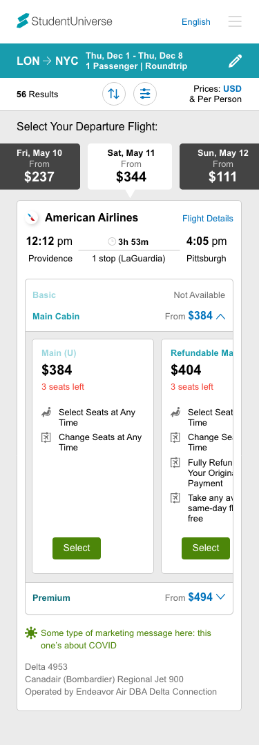
Working with various airline partners, I was determined to make some sense of these fare collection types, and assist customers in determining their value as well. Choosing the perfect flight is already a tough task, and potentially adding another layer of choice seemed like a recipe for a significant conversion rate loss. Further, this solution needed to fit as neatly as possible into our already-existing (and much user-tested) website. Also, airlines may have many degrees/types of cabins/upgrades. While many had 3-4, others had almost ten. How can these be reconciled? And at what point do too many choices result in user abandonment?
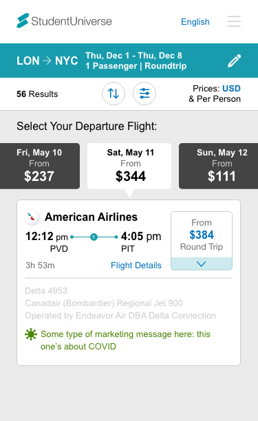
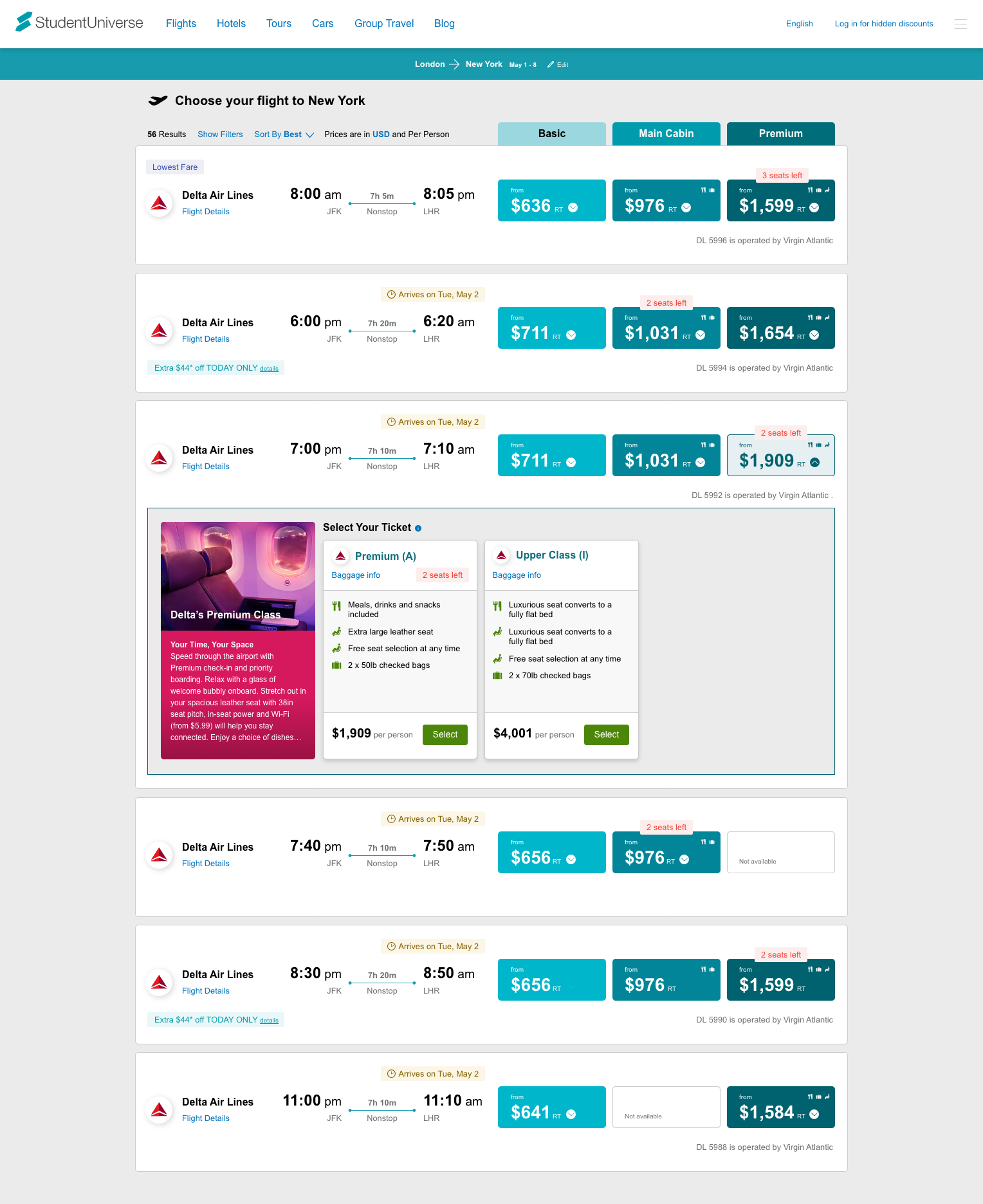
It was clear that multiple pricepoints would have to exist on a single itinerary. From user testing, it was determined that no more than three price options could be considered (and even three was pushing the conversion limits). If we could only show two to begin with, that was something to iterate upon.
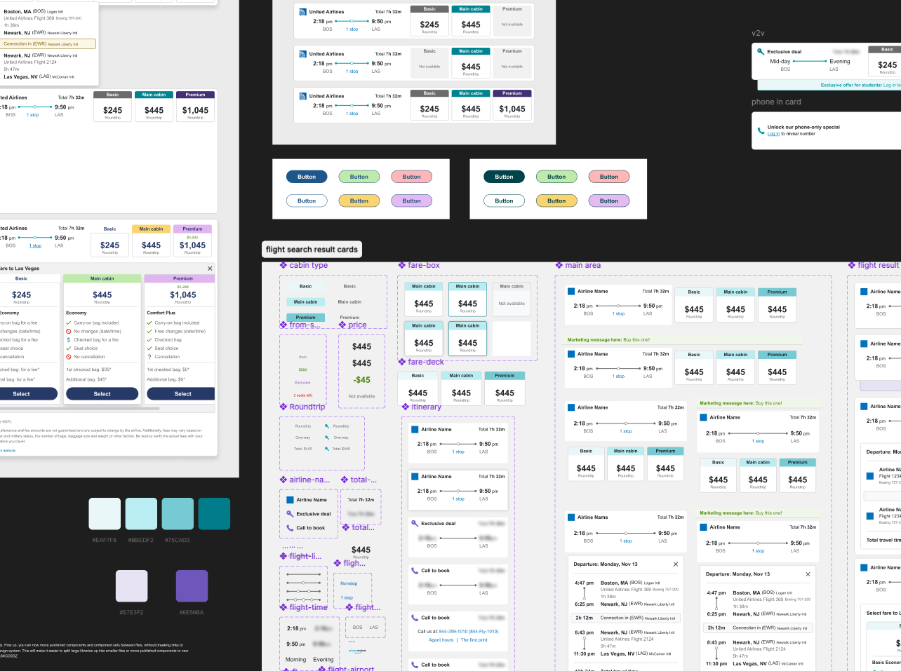
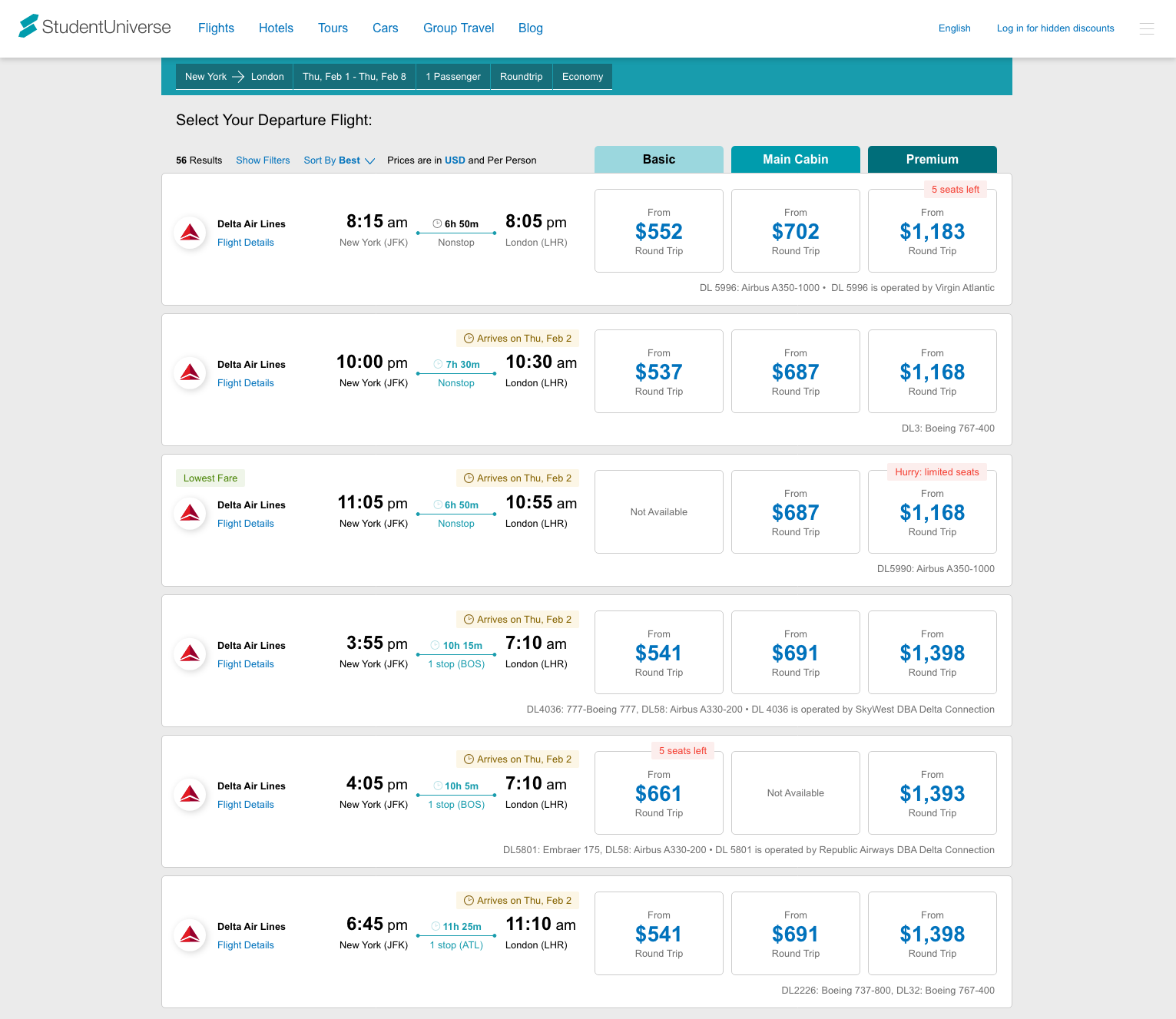
Knowing that users indicated a preference for an easy-to scan grid of price columns, I created several rounds of designs to address this. Breaking down the problem into several parts, the first was to add these three potential prices into our existing itinerary element. These high-level prices would only sparingly display cabin information, such as the cabin type and lowest price. Adding too much information in these summaries was walking a fine line of displaying only the information they needed vs. showing data that was unimportant.
From a design perspective, it quickly became obvious that whatever the solution for this, there was nothing in the existing design system that could help solve this challenge. After several rounds of testing, the one that worked best was applying shades of our primary color to each cabin collection summary, with the color getting less opaque as the better the cabin type became. As this was a novel design solution on our site, expecting users to realize this scale by means of color wasn't enough: labels would also be needed on each summary.
However, one oversight quickly became apparent as raw data was input into my initial site temples: some airlines' offerings were so firmly classified into a specific cabin type, that far too many summary sections ended up being empty. This left the perception that we did not have any inventory, when it was just the opposite.
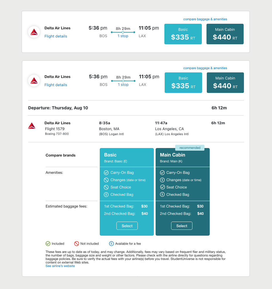
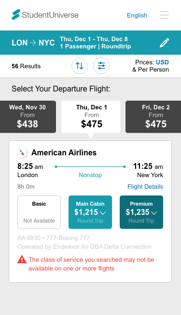

Working with back-end developers and analyzing airlines' cabin offerings, we were able to group similar cabin types into larger groupings. This would mean that any given cabin type could have several cabin types within a range that the airline had classified. Doing this, users no longer noted a perception of lack of choice: these summary areas were now filled in approximately 80% of the time.
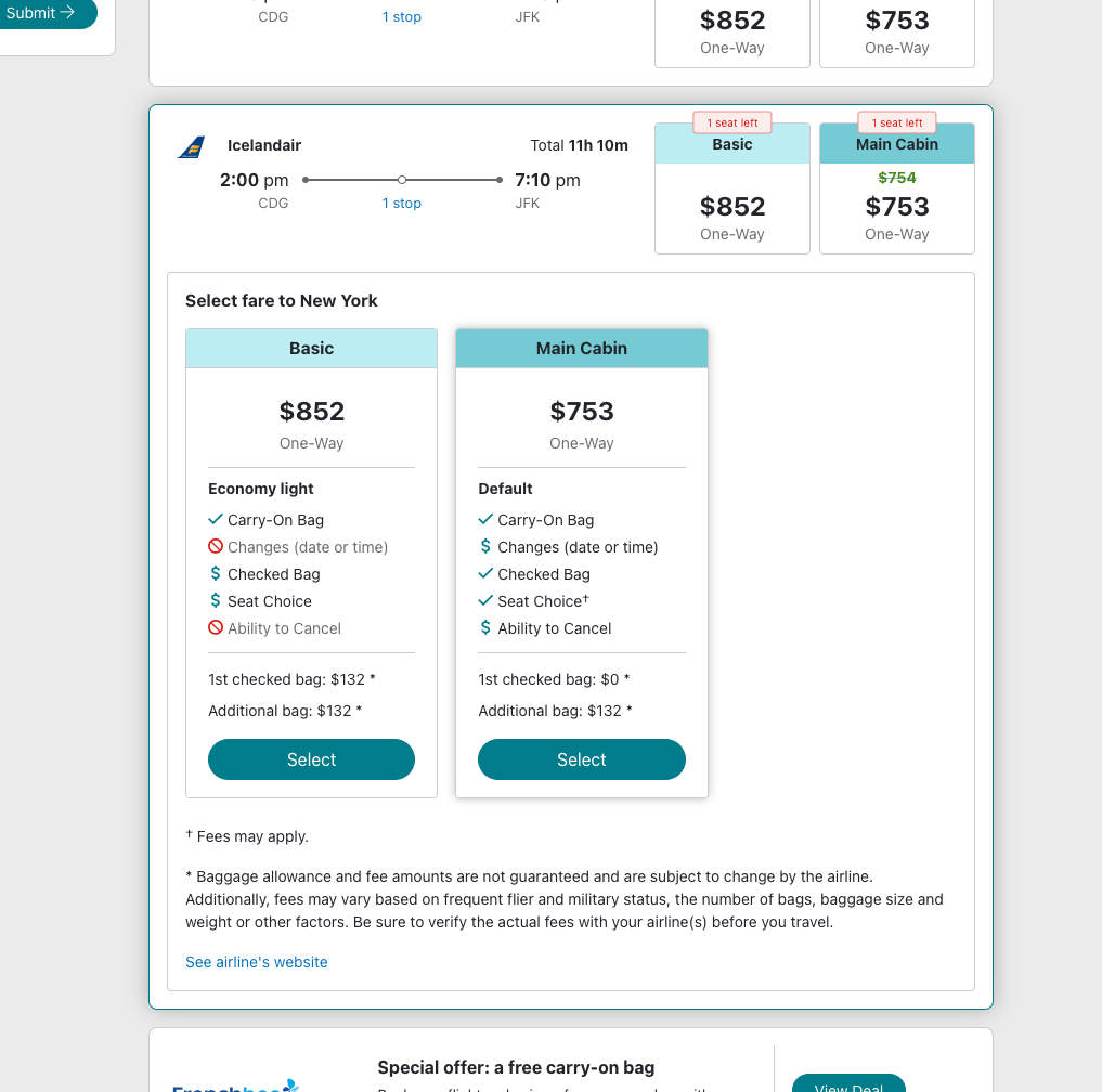
Users had long noted the importance of flight amenities when determining their purchase. However, the itinerary level couldn't display this information: for example, one cannot assume every section on a flight will have free drinks. Further, we couldn't even show these amenities on our new cabin summaries: again, not every Main Cabin offering could have a power plug... such offerings were invariably more granular.
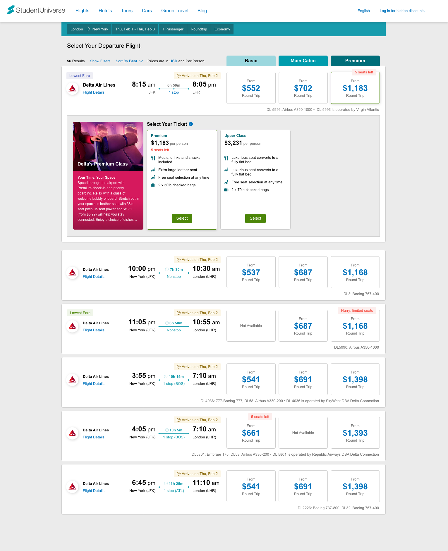
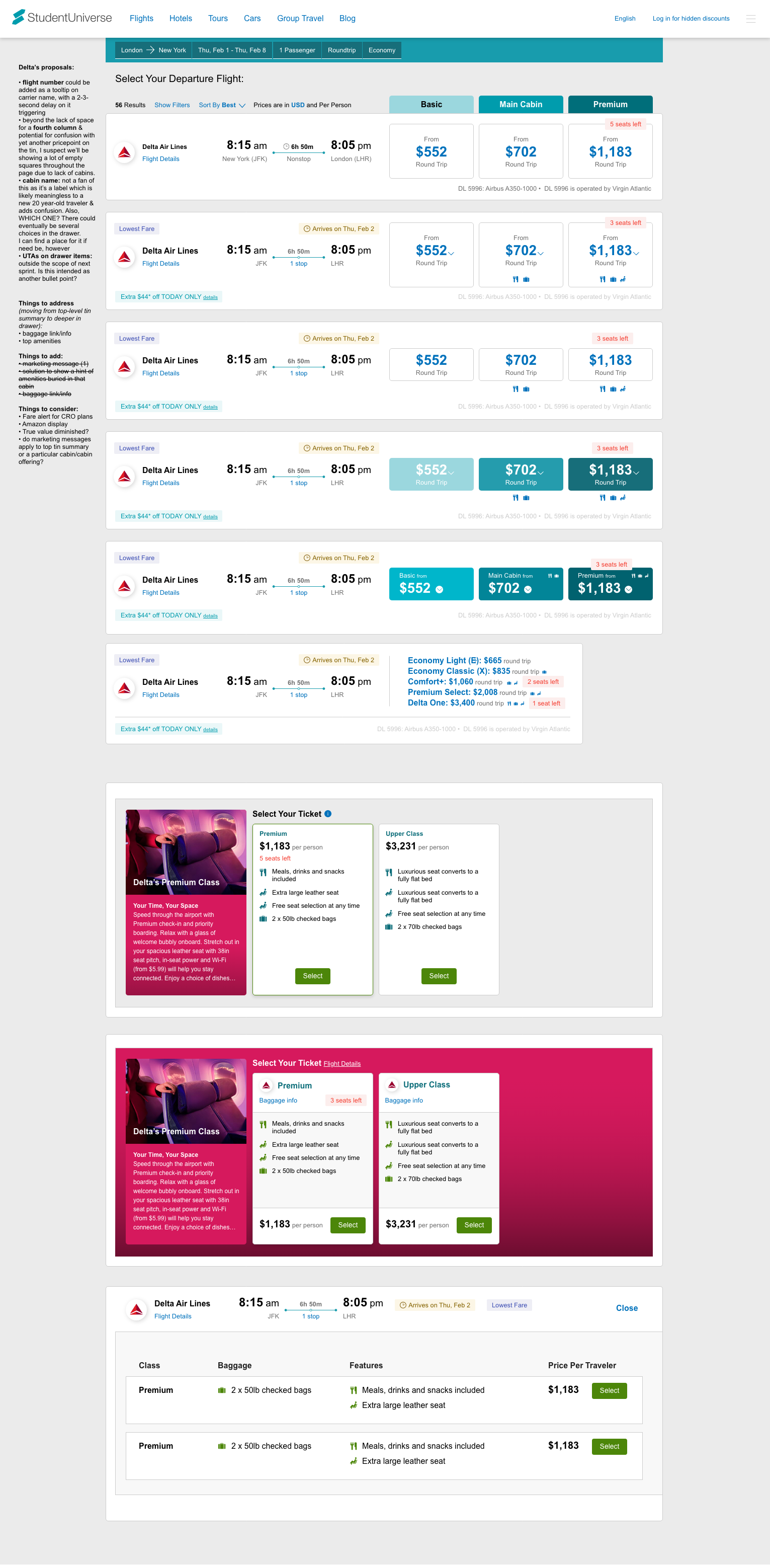
It was evident that another layer of comparison was needed: a user needed to make a deeper, more informed choice than just choosing a Basic option. Clicking the summary—an area which, up until this cabin display was conceived—would add the flight to the cart, and the user would be deep into the purchase process. Now, clicking these summaries would unveil a pane of all the seats on that itinerary, classified into that given cabin summary type, showing the distinct amenities (or lack thereof) in an easy-to compare grid. From here, the user would make their selection.
This would be a drastic change: an additional click added to the flow, the potential for confusion by our new traveler clientele by initially hiding important data, and the potential for a significant drop in purchases. However, this new flow tested very well with students. In fact, it was often noted that they appreciated the perceived assistance of us organizing flights as such in order to help them in determining the best choice for their trip. And subsequent sales trends confirmed this. Additional improvements are under consideration, but tackling a changing way of purchasing product on the most important page of our site turned out to be one of the most fulfilling design jobs I've had recently.
