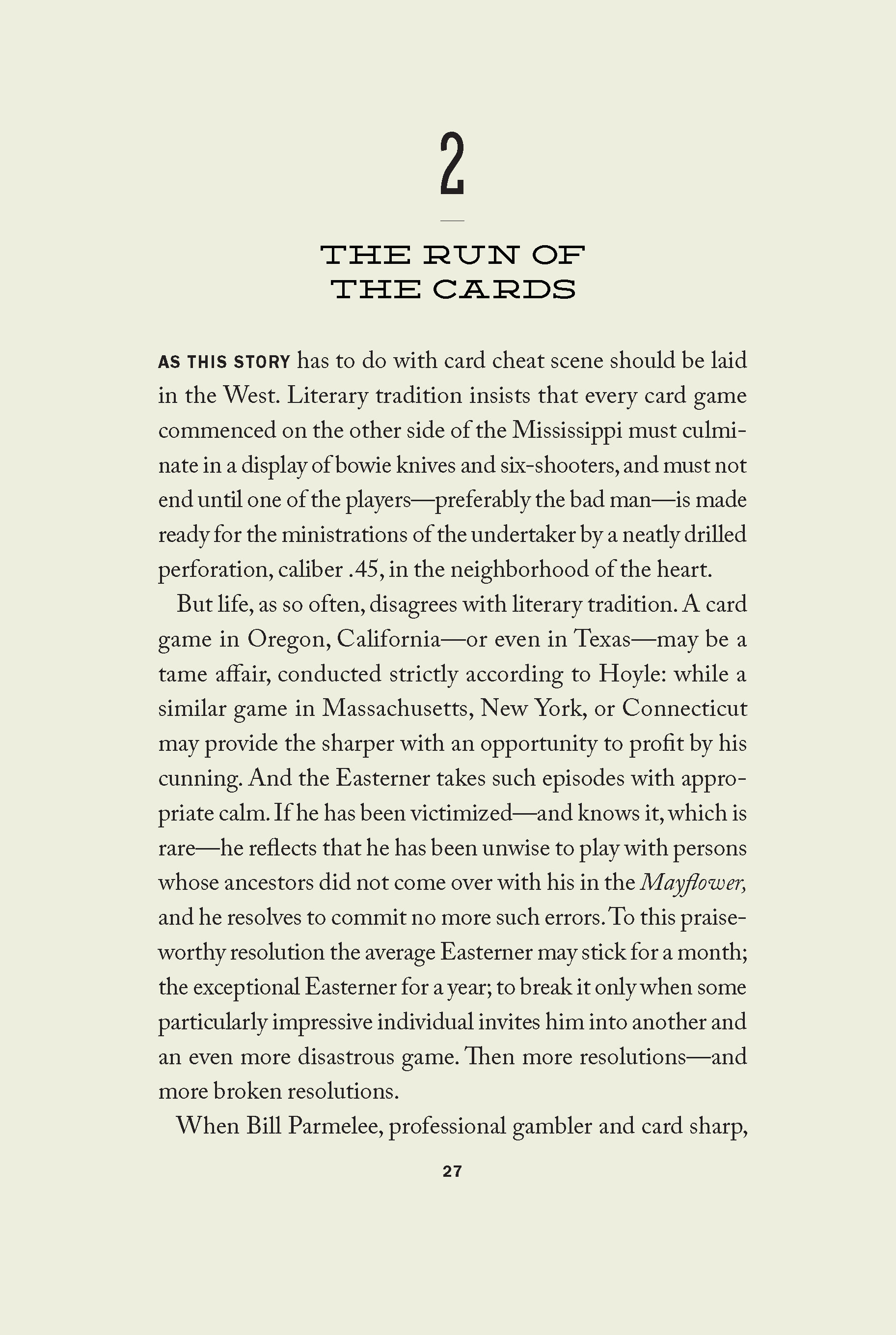
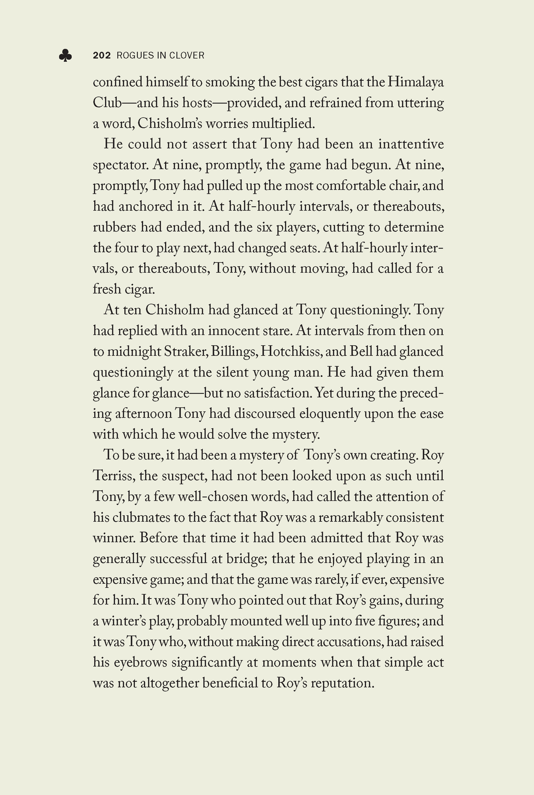
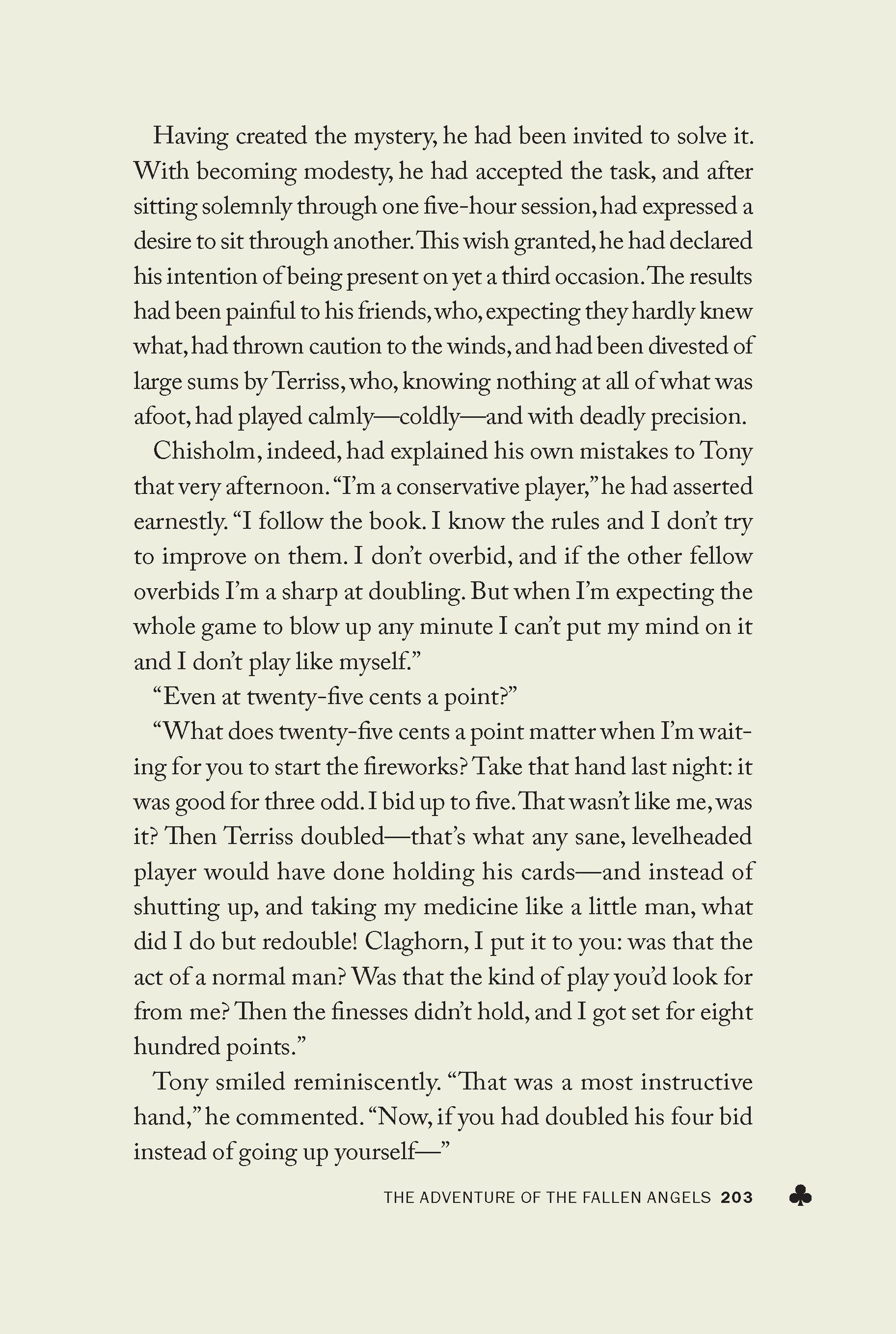
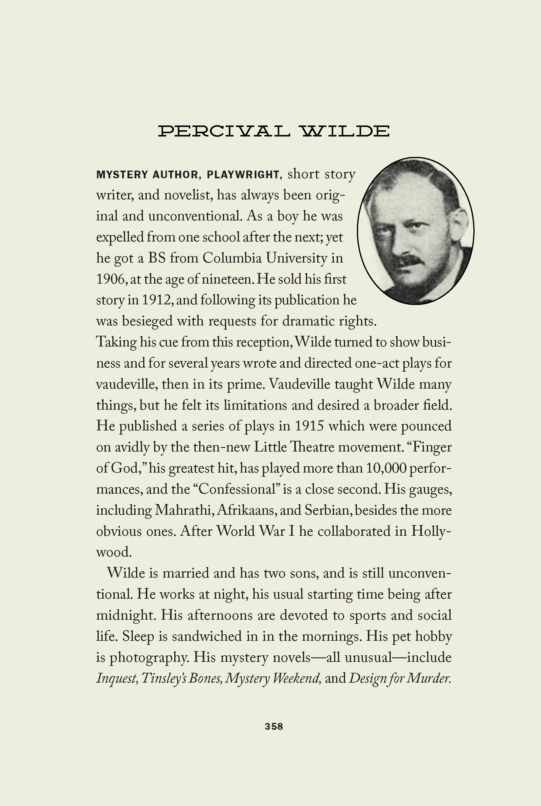
This challenging project turned out to be one of the most fulfilling design assignments I've handled. This long out-of-print book had been augmented with newly-discovered stories of the same characters, and a new scholarly introduction was commissioned, but there were no original illustrations from which inspiration could be drawn for a general design.
As the book centered on a reformed card sharp, the importance of playing cards and their suits was explored, and quickly the opportunity to utilize a font reminiscent of playing cards became apparent. The front cover was drawn by me with an emphasis on shapes rather than vintage illustrations that, while from the period, would have no connection to the original stories. Also, I wanted to rely on the book's solid typography and simply use suit shapes as supporting adornments.
I had hoped to stack the page numbers one character per line, but could never get it to work properly in InDesign without losing control of the leading.
Published in 2021


