Rolling out alongside a revamped company UX and website design overhaul, hotels was a new product offering by the company. Introduced into the redesign plan several months into the overall project, hotels benefitted by (and modified to a degree) the evolving design system I was creating.
↓ Version 1.
Business considerations:
1. Hotels needed to include amenities and third-party ratings.
2. Hostels would also be included amongst the search results.
3. Member rates (which could only be seen after logging in) were a requirement.
2. Hostels would also be included amongst the search results.
3. Member rates (which could only be seen after logging in) were a requirement.
User testing findings:
1. Users noted that photos and reviews were the biggest factors in choosing a hotel, over price.
2. Users noted the importance of seeing the hotels' distance from important city landmarks, public transportation, and other landmarks.
2. Users noted the importance of seeing the hotels' distance from important city landmarks, public transportation, and other landmarks.
Design considerations:
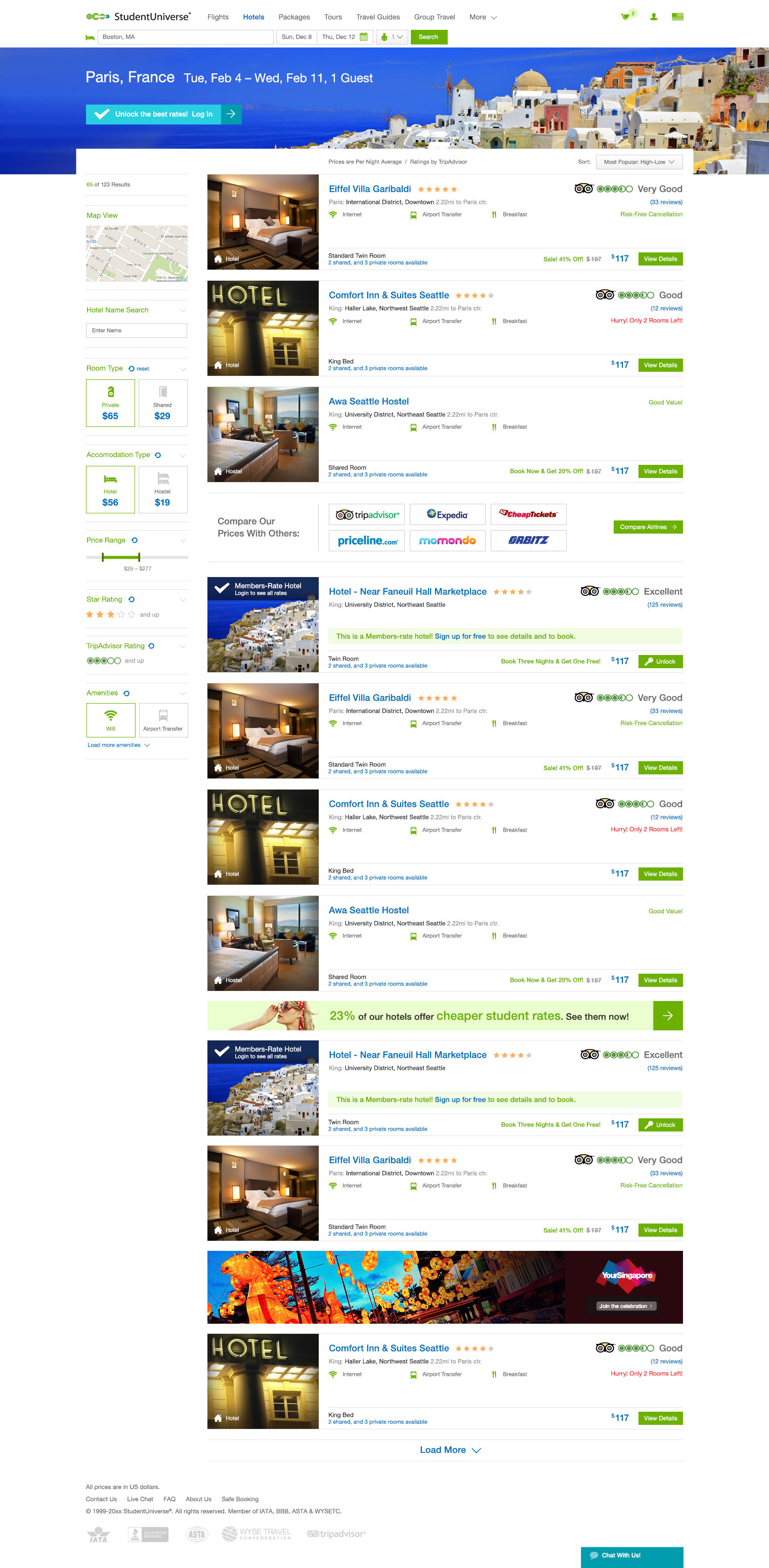
1. The way hotels were displayed and sold were different from flights at this time, so getting the UI to match the expectations as that of the flights purchase path was a challenge. At this point, flights had limited amenities which could be reliably displayed, whereas these were very common with hotels.
2. Many properties could have several room images in their data structure: when those existed, a gallery option was put in place of the single image which some hotels contained.
3. Amenities and reviews were emphasized over the pricepoint.
4. The design system had evolved at this point so that several UI elements and solutions from flights could be applied to hotels.
5. A display option was added to also offer a map-centric view (design at the bottom of this page). A property would determine if this list-view or the map view would be the default.
6. Hotels & Hostels were clearly labeled on each result.
7. A separate but similar display for member rate results was included.
↓ Version 2.
Business considerations:
1. The importance of prominent filters on flights should be applied to hotels as well.
User testing findings:
1. Users didn't easily know how to modify their search.
Design considerations:
1. Filters were added to the lefthand column to complement flights' display, using similar UX as those on flights (and added to the design system).
2. A searchbox was added to do a new search or choose different dates.
3. Specific icons were added for key amenities vs. checkmarks.
2. A searchbox was added to do a new search or choose different dates.
3. Specific icons were added for key amenities vs. checkmarks.
↓ Version 3.
Business considerations:
1. Cheapest/Fastest/Best options were no longer of importance.
User testing findings:
1. When there were simply two options within filters, these seemed to get less engagement.
Design considerations:
1. At this point, a solid version of the mobile view of flights results existed, and key UI elements were purloined from it for hotels.
2. For filters such as Room Type and Accommodation Type, these were changes to more click-friendly and visually interesting checkboxes which incorporated newly-drawn icons (and were added to the design system) which may assist users' recognition.
2. For filters such as Room Type and Accommodation Type, these were changes to more click-friendly and visually interesting checkboxes which incorporated newly-drawn icons (and were added to the design system) which may assist users' recognition.


↓ Map view, version 1.
Business considerations:
1. Offer users an alternative view of hotels search results, with their proximity on a map the prominent view.
User testing findings:
1. Interaction with this view, though lower than that of the list view, gradually improved over time.
Design considerations:
1. Clicking a property in the lefthand list view would display a marker on the map with key details. A "more info" link in the marker would bring the user to the hotel's detail page to choose the specific room, read reviews, and skim the full amenities list.
↓ Current version of the map view. Subsequent changes to the design:
Business considerations:
1. The industry expectation for hotels results display was indeed our existing map view.
User testing findings:
1. Showing all properties on the map in proximity to one another was important, rather than clicking one at a time.
Design considerations:
1. Displaying every property as its own marker—notably in tight cities—didn't allow for much of the map to be visible. Thus, grouped markers were chosen.
↓ Hotel details, version 1.
Business considerations:
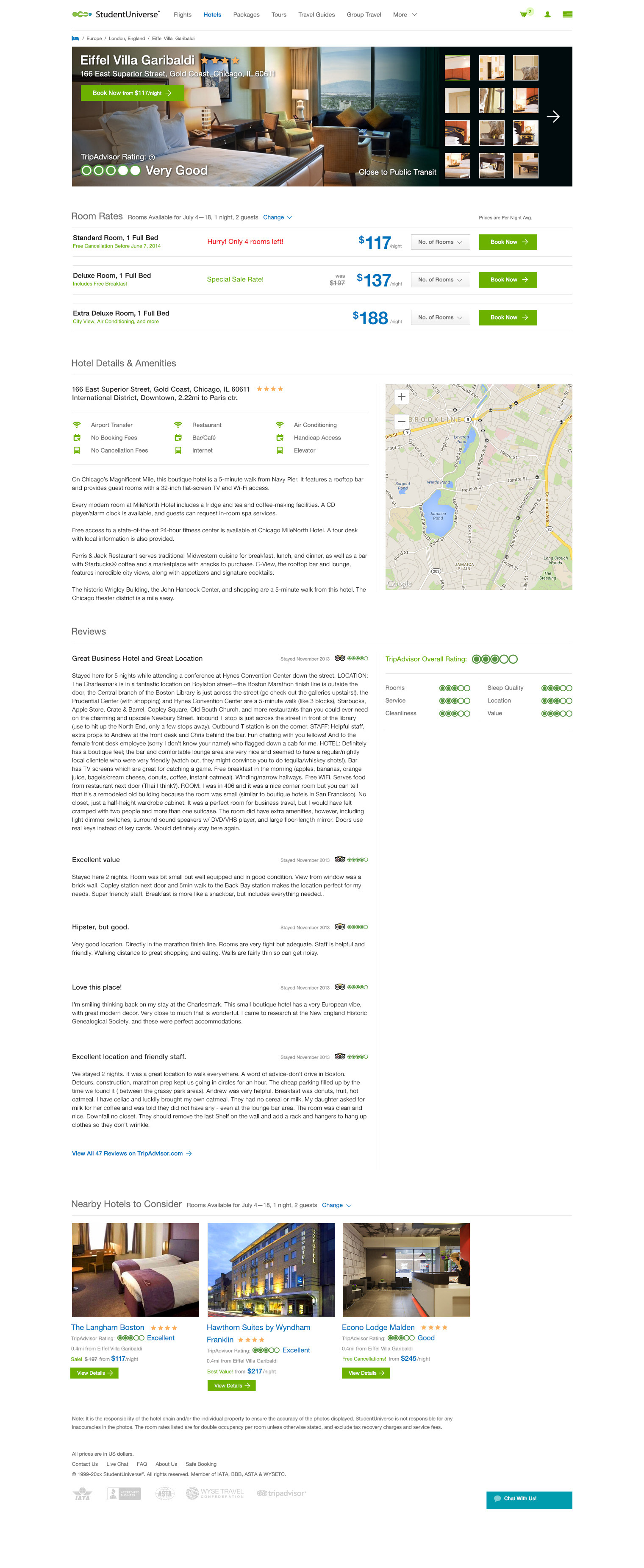
1. Allow users to easily compare a property's room types and book their choice.
User testing findings:
1. Users noted they wanted to see all known amenities (noting that what they considered important amenities may not match those we chose to display on the results page) and as many reviews as possible.
Design considerations:
1. The option to show all the property images was utilized here too.
2. Room Rates carried over messaging relating to urgency ("only 2 rooms left").
3. Since the hotels results list was a page behind this detail page, a "Nearby Hotels To Consider" block as introduced.
2. Room Rates carried over messaging relating to urgency ("only 2 rooms left").
3. Since the hotels results list was a page behind this detail page, a "Nearby Hotels To Consider" block as introduced.


↓ Hotel details, current version. Subsequent changes to the design:
Business considerations: none.
User testing findings:
1. Room Rates were too easy to scroll past.
Design considerations:
1. Rooms were framed out in a grey section.
2. A per-section navigation was added to get back to the Rooms section for easy booking.
2. A per-section navigation was added to get back to the Rooms section for easy booking.
