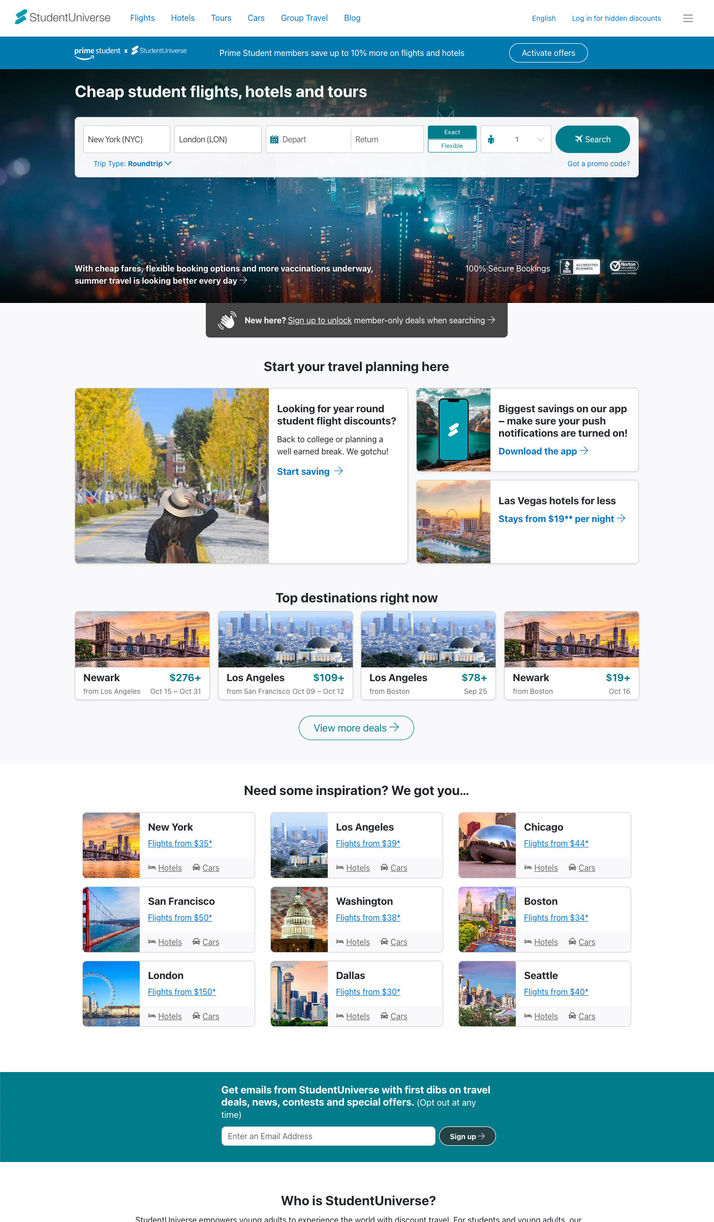
A site design for a student travel agency. Previous versions of the site were very basic. With this new version, I was given the task of not only updating the website, but also the entire company's UX, which not only covered the website, but email newsletters, trade shows, print collateral, and the like. All of these needed to have a uniform voice and methodology to invite student to not only explore and book travel, but to be repeat customers.
↓ Current version.
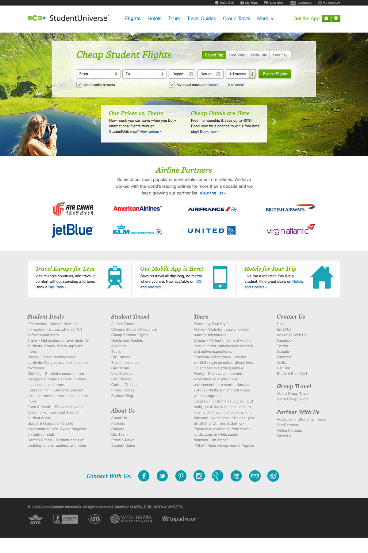
↓ Version 1.
Business considerations:1. Address a way to search other products (hotels and tours) that need to be a single click away.
2. Improve SEO.
3. Promote brand confidence and confidence by incorporating well-known airline partners.
4. Explain the company's unique value proposition.
2. Improve SEO.
3. Promote brand confidence and confidence by incorporating well-known airline partners.
4. Explain the company's unique value proposition.
User testing findings:
1. The feel of the existing website didn't look anything like the e-newsletters customers received.
2. The company's existing UX seemed cold an uninviting.
3. Users weren't sure why they'd buy from us instead of an airline directly.
4. Customers weren't aware that we had non-flight products which could assist them in their travel plans.
5. The process to search was confusing for many first-time travelers.
Design considerations:
1. Integrated brand colors to assist customers in understanding search and emphasize brand cohesion.
2. Made the site more welcoming by use of clean, inspiring images which could be art-directed to match our brand. This would mean an emphasis on vibrant, breathtaking photos which would be used in all user-facing media. In addition, this Version 1 proposed the use of serifed fonts for more of an organic feel.
3. Make the search form as easy to understand as possible and removed (or diminished) form elements that weren't required to perform a basic search.

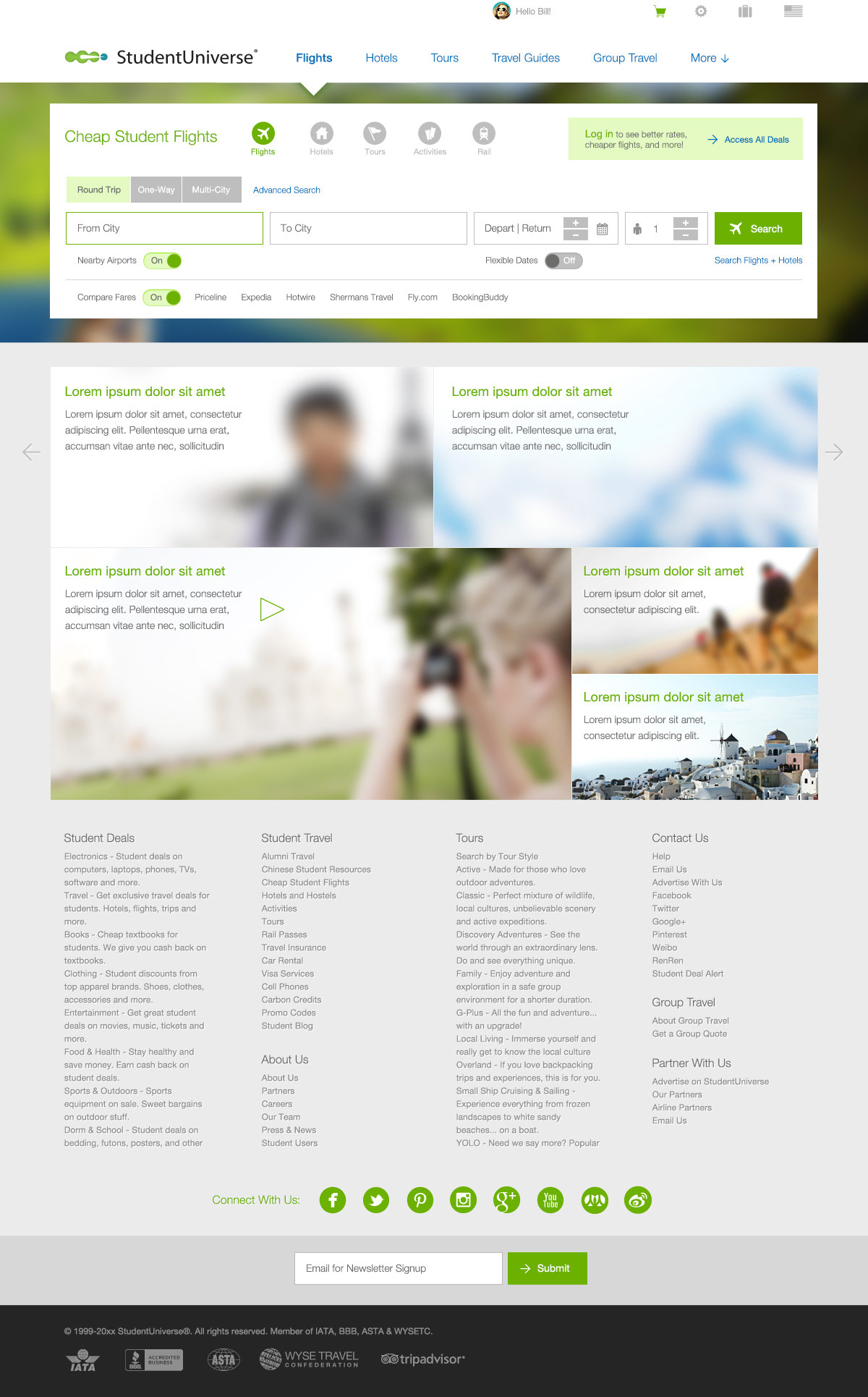
↓ Version 2.
Business considerations:
1. The use of serifed italics didn't fit into the desired brand.
2. Basic form checkboxes looked bland.
3. Two layers of search via product were actually needed for SEO reasons: a top banner which would point to static product URLs, and searchbox products, which the user could switch between on any search form.
4. Make the cumbersome requirement of signup be as painless as possible.
5. Additional places to display marketing information (addressing brand confidence could be done here).
User testing findings:
1. The feel of the existing website seemed much fresher and elements were clear.
2. The search form was easier to understand, but could be improved.
2. The search form was easier to understand, but could be improved.
Design considerations:
1. The importance of displaying a unique value to users should initially explain the value of logging in (as better deals will be seen in the search results).
2. Made the form elements' radiuses acute and introduced more stylized form elements, such as radio switches.
3. Further integrated variations of brand color to promote positive movements (this being green/active).
2. Made the form elements' radiuses acute and introduced more stylized form elements, such as radio switches.
3. Further integrated variations of brand color to promote positive movements (this being green/active).

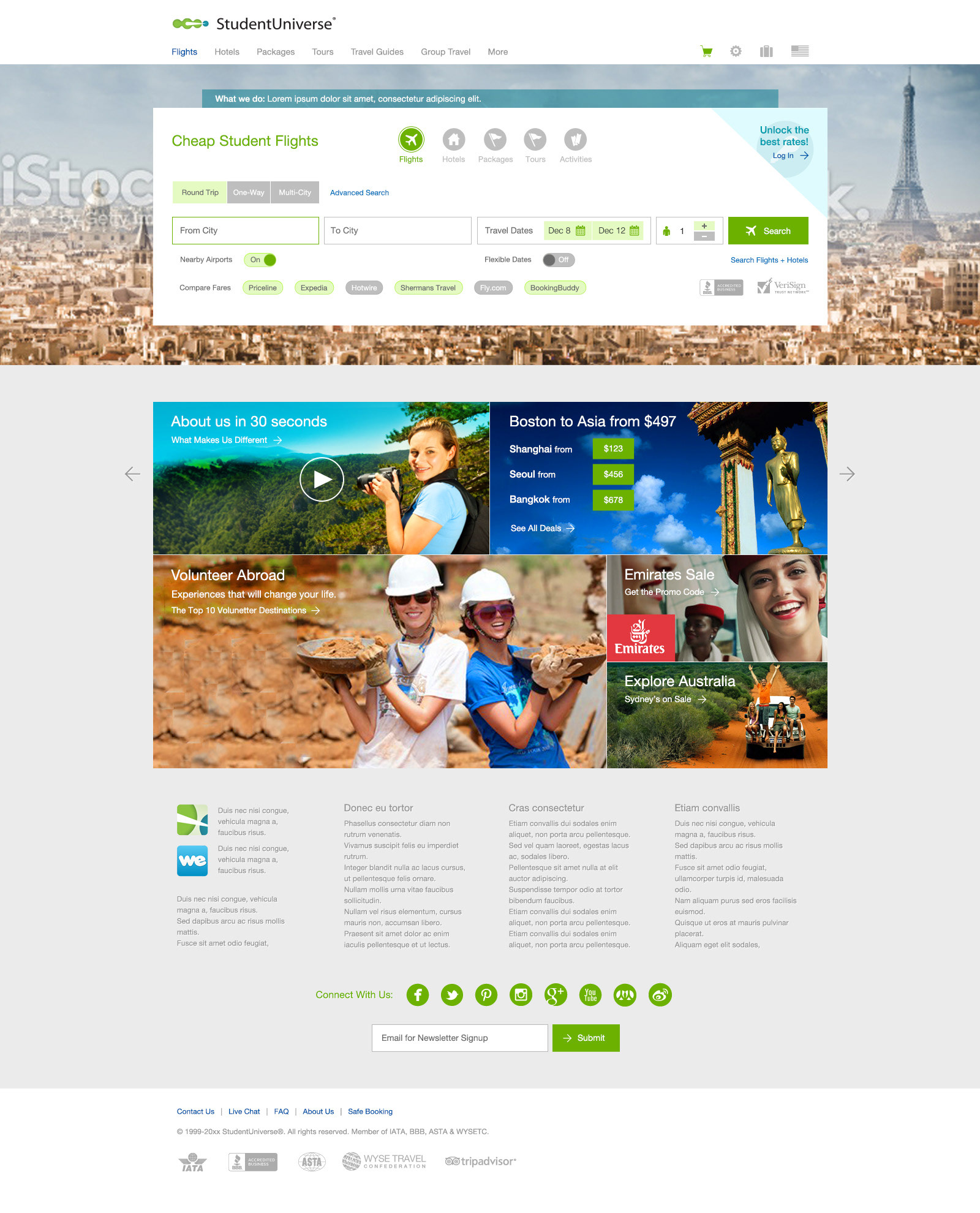
↓ Version 3.
Business considerations:
1. The compare partners in the "Compare Fares" row needed to be individually turned off/on, rather all at once.
2. The large background image would likely be difficult for Marketing to art direct, given how much would be obscured by the form.
2. The large background image would likely be difficult for Marketing to art direct, given how much would be obscured by the form.
User testing findings:
1. Users who didn't know of the company still had hesitancy about doing a search.
2. The search area was fairly large and seemed disorganized to a degree.
2. The search area was fairly large and seemed disorganized to a degree.
Design considerations:
1. The spot use of our secondary color (blue) was introduced for use in elements which were more informational than transactional. This would also assist in highlighting the elements we deemed most important.

↓ Version 4.
Business considerations:
1. Secondary color looked drab.
User testing findings:
1. Search form still seemed to have unneeded elements.
2. Users didn't immediately understand how to interact with the compare options.
2. Users didn't immediately understand how to interact with the compare options.
Design considerations:
1. A brighter version of blue was introduced.
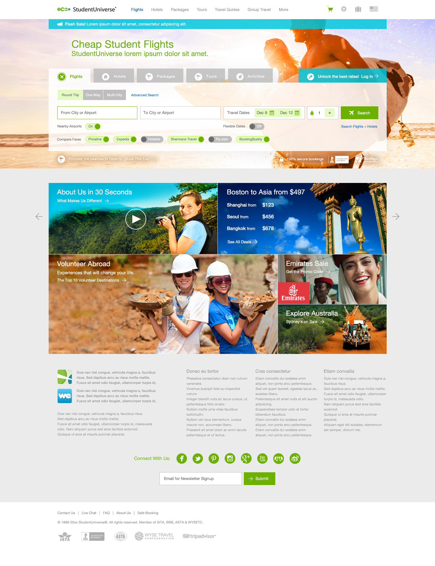
2. More space was used to frame the searchbox, it was made semi-opaque, the trust symbols were moved outside, and product tabs were introduced to cut down the fields to the bare essentials.
2. Compare options were changed to use the swipeable on/off pattern already in use.
2. More space was used to frame the searchbox, it was made semi-opaque, the trust symbols were moved outside, and product tabs were introduced to cut down the fields to the bare essentials.
2. Compare options were changed to use the swipeable on/off pattern already in use.

↓ Version 5.
Business considerations: none.
User testing findings:
1. Users couldn't always swipe the compare radios, especially when the text was lengthy.
Design considerations:
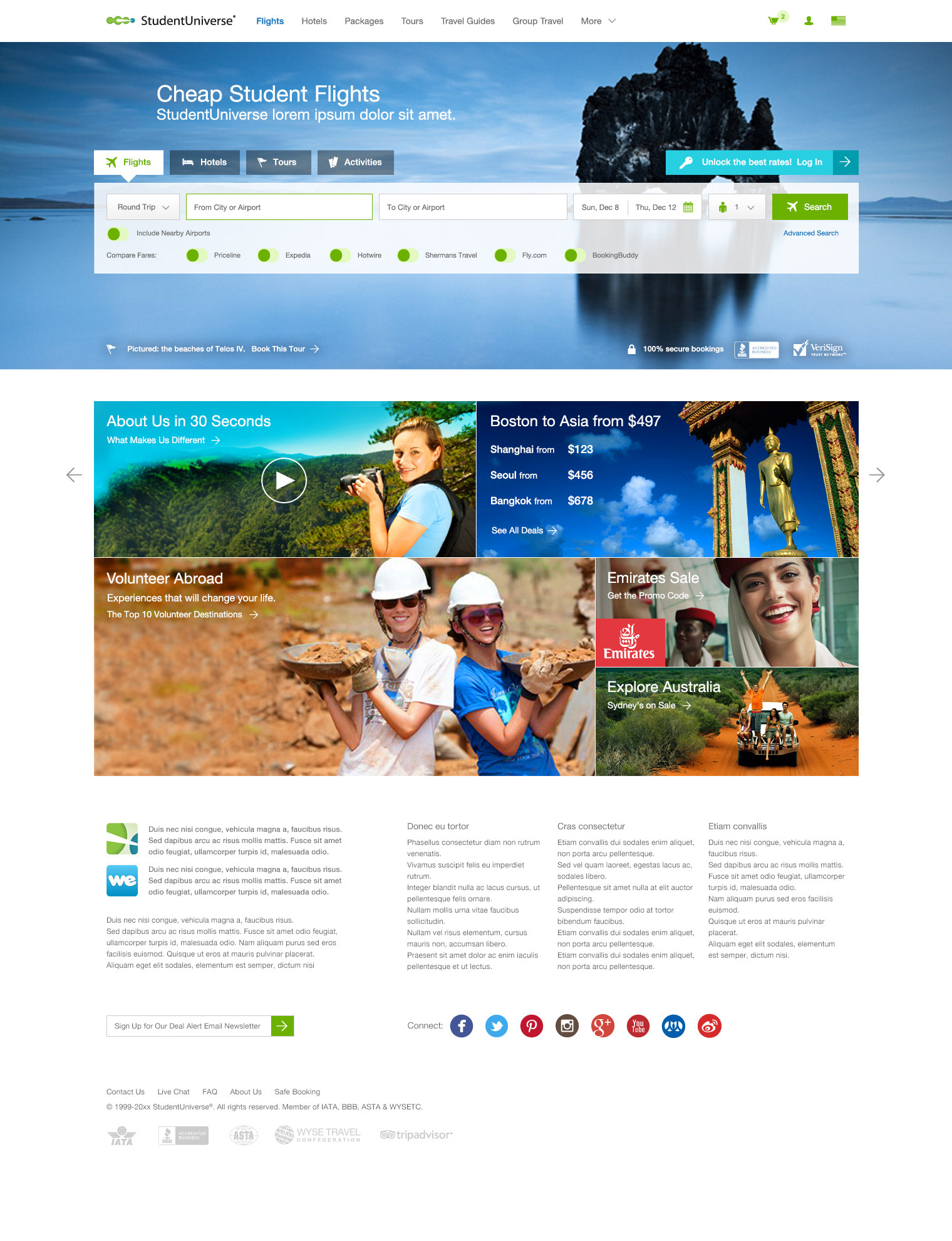
1. Compare radios were changed to simple ones which lived next to the sometimes-lengthy text.
2. Trip type was moved to a select menu, which compressed the searchbox further.
3. Search tabs were given bottom arrows (an element added to the site's design patterns), which made the product tabs easier to see and framed the contents better.
2. Trip type was moved to a select menu, which compressed the searchbox further.
3. Search tabs were given bottom arrows (an element added to the site's design patterns), which made the product tabs easier to see and framed the contents better.

↓ Version 6.
Business considerations: none.
User testing findings:
1. Compare on/off radios still met with user hesitation.
2. Users didn't understand the value of searching nearby airports.
2. Users didn't understand the value of searching nearby airports.
Design considerations:
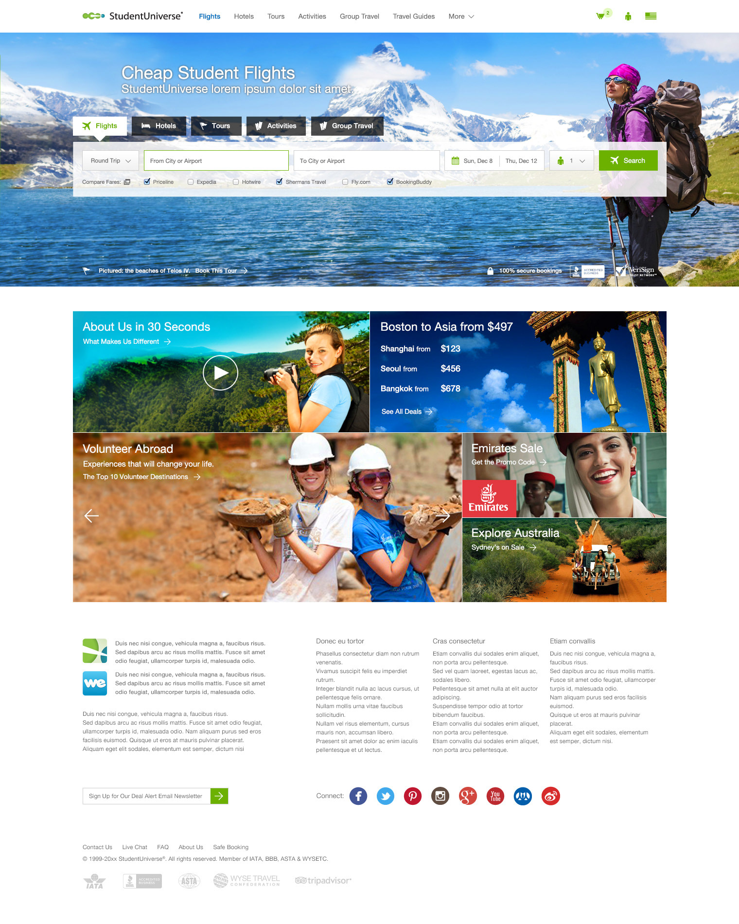
1. Previously-used fancy sliding radios were replaced with instantly-recognizable checkboxes.
2. The option to search nearby airports was removed.
3. Relying on colors or logos in the hopes that users will infer their meanings is bad practice. This has been addressed on the search tabs in the mobile view.
2. The option to search nearby airports was removed.
3. Relying on colors or logos in the hopes that users will infer their meanings is bad practice. This has been addressed on the search tabs in the mobile view.

↓ Current version. Subsequent changes to the design:
Business considerations:
1. A new logo was needed.
2. A way to display example destinations without doing a search was needed.
2. A way to display example destinations without doing a search was needed.
User testing findings:
1. Acute angles on elements weren't immediately recognizable and conversions and familiarity could be improved.
Design considerations:
1. Form elements have been modified to respect current UI expectations.
2. A new logo was created by the company's designers which more blatantly related to travel (crossroads).
3. A higher contrast ratio on elements was introduced due to accessibility audits.
4. A destination fares section was added to the homepage to display typical fare that a user could expect.
2. A new logo was created by the company's designers which more blatantly related to travel (crossroads).
3. A higher contrast ratio on elements was introduced due to accessibility audits.
4. A destination fares section was added to the homepage to display typical fare that a user could expect.
